Watch Face
PUBLISHED
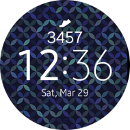
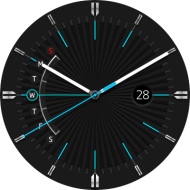
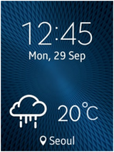
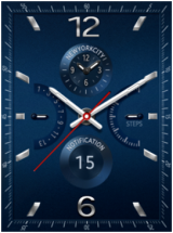
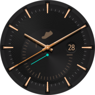
The Watch Face is the first screen displayed when you turn on the wearable device. Pressing the Home key closes the running application and brings the user to the Watch Face.
Watch Face States
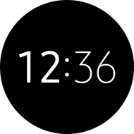
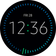
The Watch Face has two different display states: “active” and “always-on.” The active state Watch Face is shown when the user is interacting with the wearable device. It displays every detail that a designer has chosen to add to it. Watch Faces in an always-on state use less battery power, so they are limited to showing just the time of day, and very little else.
A user can turn off the always-on state Watch Face if their battery is running extremely low, but it is still recommended to design for both states so that users can switch between states whenever they wish.
Active State
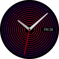
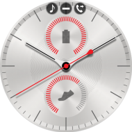
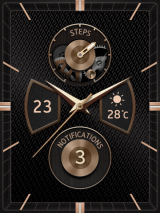
When a user lifts their wrist, the active state Watch Face is usually the state that’s shown. Watch Faces must respond quickly to any user interaction, so colorful and coherent designs are recommended. Icons may be added to a Watch Face to let users launch apps directly or to convey information at a glance
Always-on State
Designed to display the time by using just a tiny amount of battery power, always-on states only show the key Watch Face components, as well as the hour and minute hands. Because the display updates once every minute, it is not recommended to show seconds ticking by, or any other real-time information on an always-on state.
If a Watch Face does not have a corresponding always-on state, the system provides a default one.
Color limitation
Due to the improvements in the quality and capability of wearable device displays, two different color schemes are now available for always-on states: low-bit color and high color.
In low-bit color mode, the always-on state only uses cyan, magenta, yellow, red, green, blue, and white colors at their full brightness. Greyscale or gradients cannot be used.
Always-on states in high color mode have no such restrictions, so they can match their active counterparts more closely.
Battery consumption
To optimize the battery consumption for the always-on state, only cover a maximum of 15 percent of the display area with pixels. Simply add up the RGB values yourself to calculate how many pixels you’re using.
Screen burn
When an always-on state is in use, the system moves the Watch face around at regular intervals by just a few pixels in order to prevent a burn-in effect occurring on the OLED display. Be aware that design elements near the edge of a Watch Face can be pushed out of the display when this happens.
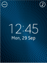
Watch Face with System Icons
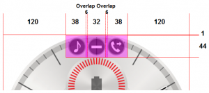
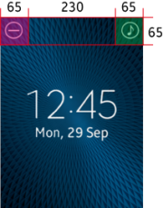
Watch Faces may use small system icons that display the status of a particular function or setting. When you work on a Watch Face design, avoid placing any action button in a place that’s reserved for these types of icons.
Refer to the following screenshots for the dimensions of the system icons.
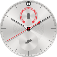
A ‘lock’ icon appears at the top of the Watch Face when Screen Lock is turned on.
Design Guidelines for the Watch Face
Design with style in mind
Watch Face design can appear differently on a wearable device compared to a computer monitor. As there are many types of wearable devices with unique industrial designs, consider the aesthetics of your Watch Face to make them appealing to fashion-conscious users.
Be clear in your aim
Watch Face should have one primary aim. Users will download and collect a number of different Watch Faces to suit different moods. So Watch Face with a functional aim should use make these functions big, bold, and easy to interact with. Watch Face with a primary aim of relaying the time should make hands, numbers, and dials sharp and clear

