Pop-up
PUBLISHED
Pop-ups can give users vital information when completing a task. They can carry a number of actions and are especially useful when the notification requires the user to respond.
You can use the following types of pop-ups:
- Notification pop-up
- Toast pop-up
Notification Pop-up
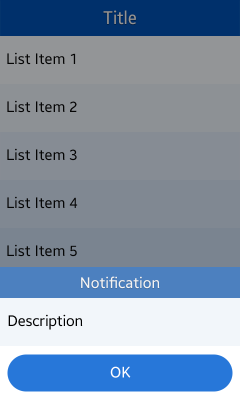
Notification pop-up appears at the bottom of your application screen. Keep the following guidelines in mind when designing a pop-up:
- Display the pop-up when your application requires immediate user attention.
- Use pop-ups to provide information and prompt users to make selections for the next task.
- Make various combinations of text, images, icons, and edit fields available so that the user receives the correct message and can take appropriate action.
- Provide relevant buttons in case the user needs to confirm or cancel an action. Interacting with a button closes the pop-up. A pop-up with no buttons disappears from the user's screen after a predefined amount of time.
Figure: Notification pop-up

Toast Pop-up
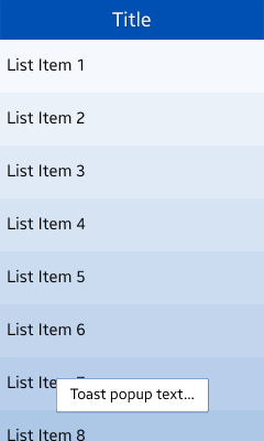
Toast pop-up can be used to inform of simple notifications or changes in the current state.
When notifying information about the result of an action, use the action name, such as Moved or Copied.
Figure: Toast pop-up

카테고리:
UX 가이드
