Design Principles
PUBLISHED
User experience design for a Tizen wearable device shares the traits of other wearable platforms. The wearable device must be small enough to be worn and must be accessible on the go. For wearable UX design, the size of the wearable device and the smallness of the screen are two of the greatest challenges.
However, this does not mean that Tizen wearable is the same as other wearable platforms. By fine-tuning the limited resources and adding new features to complement the screen size, Tizen wearable provides a user experience well beyond the screen size. The following are the design principles that make it possible.
Glanceable : Provide Bite-sized Information on the Go
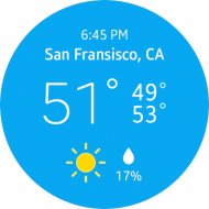
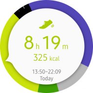
Glanceability is important when users need to quickly decide whether to dismiss a notification or find out more about it. Information displayed on the wearable device should be concise and informative, offering bite-sized updates that show users the most important details at a glance.
Design Your Main Idea to Draw Attention
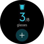
Place the main idea in the middle of the screen in a size large enough to draw the user’s attention. This simultaneously increases the visibility and usability of your design.
Streamline your designs by getting rid of low-importance features and screens, and keep only the essential information. Provide dynamic information that requires minimal user interaction, which is directly related to the user’s current situation.
Overly complex procedures or too much information on a small screen adversely affect glanceability.
Be Simple and Concise
Design your screen with a simple structure and layout. You can emphasize key information by displaying it in large font.
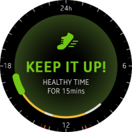
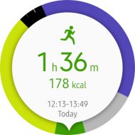
Use graphical information whenever applicable. Effective use of icons not only reduces text, but it also improves glanceability. Use simple graphical elements that convey meaningful information to replace text and simplify your design.
Keep your descriptions brief and clear. Avoid detailed information that requires too much reading; a wearable device is not designed for serious reading.
Use exact words that convey the main idea and leave out unnecessary information. Consider the tone and manner of your writing, and use effective writing techniques to convey more information with fewer words.
Refer to Wearable Writing Style Guide for details.
Keep Outdoor Use in Mind
Wearable devices are primarily designed for outdoor use. Your best designs and content may be useless if they are not visible outdoors. To allow your design and content to stand out in the outdoors, use dark-colored themes. Dark colors result in better contrast, making your content more visible under direct sunlight.
Design beyond the Boundaries
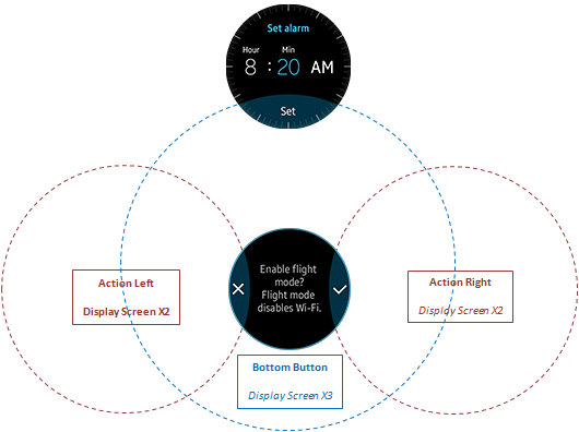
Think outside the screen to create a bigger picture. Design your screens to be a part of a structure where multiple screens organically interconnected. Draw bigger screens outside of the physical screen area and place buttons or visual cues on the overlapping areas of the screens.
Context-rich : Keep Your Pages Easy to Follow
Provide navigational structures that orient users. Consistent, meaningful, and intuitive structure designs help users navigate pages and understand the context.
Display contextual information, such as indicators and visual cues, on the screen to allow users to identify which information they are accessing and what they need to do for their next interaction.
Design Intuitive Transactions
Create intuitive and meaningful connections between major elements. This can help users more easily understand the current information and its context.
Design multiple screens with an organic flow to create easily navigable content.
Design Your Pages to be Consistent
You can choose to apply various native or third party color themes to your designs. No matter what, remember to create consistent screen designs. Consistent designs prevent confusion by allowing users to identify your app by color, type, and layout design.
Fast and Responsive : Boost up the User Experience
Nothing is more frustrating than a slow, unresponsive device. It deprives users of confidence in the wearable device and the feeling of control.
Design apps to minimize user input. Provide user interfaces that are easy to operate, and help users reach their goals in the simplest and fastest way.
Design apps to immediately react to user inputs in an obvious way. Clear and immediate responses in user interactions are very important because they provide users with the confidence that their inputs have been duly received by the wearable device.
Design Your Elements to be Easy to Interact
Design your on-screen UI elements in a size that makes interactions easy. Unresponsive, small buttons make interacting with the wearable device difficult.
When designing user interface elements, such as buttons, make sure that they are large enough for user interaction.
Design Your Interactions to be Natural and Responsive
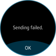
Design your screens to provide feedback for each interaction as soon as a user input is received. Responsive designs increase user confidence in the product. Ensure that selections clearly change after a user takes action and the subject of the user interaction is displayed during the feedback so that users know what is happening on the screen.
Visual effects, such as transitional animations, provide natural responses to user input. For example, a “page transition” effect naturally presents page movements and a “page end” effect informs users that they have reached the end of the page. When you design screen transitions, ensure that you present the screens in a natural and intuitive way. For example, the direction of rotary action must conform to the movement of the screens displayed on the wearable device.
Physical feedback can help users better recognize changes on the screen as well. For user interactions, such as touch and rotary action, provide responsive feedback that complements visual and physical changes on the screen.
Physical responses, such as haptic or auditory feedback, help users complete tasks without needing to fully focus on the screen. This vastly enhances the actionability and glanceability of the wearable device.
Avoid Redundancy
Avoid nonessential procedures that require user interactions. Create interactions only if they are necessary. This approach allows users to complete actions in the fastest and simplest manner.

Attractive : Design Apps that Draw Attention
When designing wearable apps, keep in mind that different users have different needs and interests. By providing a wide range of customization and information display options, your app can appeal to multiple user groups.
The aesthetic aspect of the screen design is important as well. Providing users with unique and stylish screen designs is essential to designing successful apps.
Design Your Screens to Appeal
Provide screen designs that allow users to view specific information. Consider the variety of existing user groups and try to make your designs satisfy each group’s interest. Think of the possible user scenarios and provide information that fits most situations.
Design Stylish Screens
Although not all apps that look good are successful, successful apps usually do look good. This is especially true for wearable apps since wearable devices are considered a fashion item to users.
Let’s take Watch Faces as an example. One of Tizen wearable’s best features is its interchangeable Watch Faces. Users can choose Watch Faces based on preference, occasion, season, or even their mood. Classical clock designs may be good for formal occasions and unique designs can be used for more casual occasions or for everyday life.
Stylish designs allow users to view their device as a fashion accessory. Be creative and provide a variety of unique designs that users can enjoy. Using typographic elements for decorative purposes is a good idea. On a wearable device, text is not recommended for conveying main ideas, but typefaces can serve as design elements to make your designs look nice.

