navigation
Tizen UX Conversion Tutorial: Tab-Based Menu Navigation Tutorial - Part 2
PUBLISHED
Tab-Based Menu Navigation
Overview
This article is part two of a two part series that demostrates the Tab based navigation design, implemented in part 2 using Tizen web UI framework. And the UI is modified to follow the Tizen UX Guidelines.
- Read more about Tizen UX Conversion Tutorial: Tab-Based Menu Navigation Tutorial - Part 2
Accessibility
PUBLISHED
To deliver screen information effectively to users with disabilities, the Tizen platform offers:
- Screen reader
- Font size adjustment
Design your application to offer visually impaired users an accessible, consistent, and enjoyable user experience.
Navigation
PUBLISHED
Navigation in Tizen follows the principle that a device's screen must move and change according to changes in the application depth. The navigation design must be consistent so that the user can clearly understand which depth and screen of the application they are currently using.
Since navigation is the single biggest factor affecting an application's overall usability, we encourage you to consider navigation-related issues as early as possible in your application development process.
Split View
PUBLISHED
The split view consists of two separate viewing areas. If an application uses the split view in landscape mode, the application screen automatically changes from portrait to split view. You should only apply the split view design in landscape mode.
The purpose of the split view is to display more information beyond simply widening a list. For example, you may wish to give users a preview of the content. Make sure you display any lists or added depth in both portrait mode and split view.
Footer
PUBLISHED
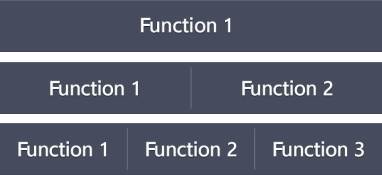
As its name suggests, the footer appears at the bottom of your application screen. You can place function buttons in the footer if the function is essential, or if a prompt feedback is required.

Keep the following guidelines in mind when designing your footer:
