UX Guide
Body
PUBLISHED
The body is the area visible between the header and footer. Your application's body can contain various content types, such as different kinds of lists or menus.
List
This is the most basic type of body content. You can use lists to display either single-line or multi-line items in an orderly manner. Each list item can have various elements, such as text, an icon, a thumbnail image, or a button.
- Read more about Body
Application Structure
PUBLISHED
The Tizen platform features a range of UI components. The purpose and functionality of your application determine the components (and layout) you select. In this section, we will use Tizen's available UI components to demonstrate the most basic form of an application structure.
Footer
PUBLISHED
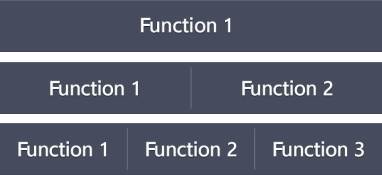
As its name suggests, the footer appears at the bottom of your application screen. You can place function buttons in the footer if the function is essential, or if a prompt feedback is required.

Keep the following guidelines in mind when designing your footer:
Header
PUBLISHED
The header, which appears at the top of the application screen, is a word or phrase describing that screen's content or purpose. Depending on their format and function, headers fall into one of the three categories:
Asset Library
PUBLISHED
Fonts
Tizen uses the TizenSans family fonts. The TizenSans family consists of regular and medium weights by default. You can download useful fonts from here and use them in your applications.
Terminology
PUBLISHED
There are two important UX design features that help application users read and better understand application-related controls and events: a recognizable font and standard terminology. To make the text legible and easy to understand, you must select the shape, size, and color of the text font, as well as the application background color. In addtion, the use of appropriate graphic design will also enhance text legibility.
Visual Style
PUBLISHED
The following components will help you incorporate Tizen's elegant visual style into your applications:
Design Library
PUBLISHED
The following UI components are the basic screen elements of your application:
Typography
PUBLISHED
To support its overarching design principles and unique visual style, Tizen uses a dedicated font family named TizenSans. The TizenSans family supports regular and medium weights by default.
